
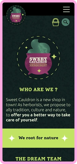
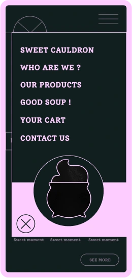
Sweet Cauldron
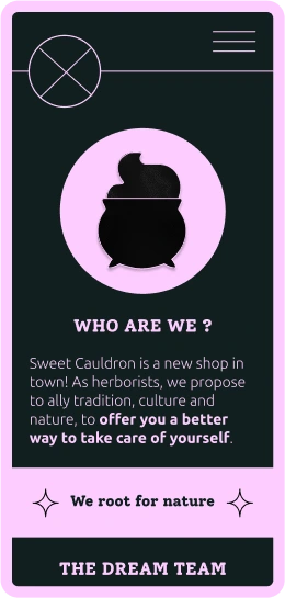
Sweet cauldron is the website of a fictive herbalist, drowned is magical and witchy aesthetic.
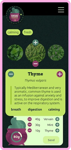
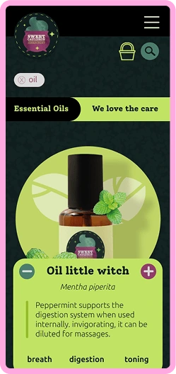
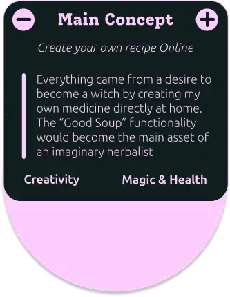
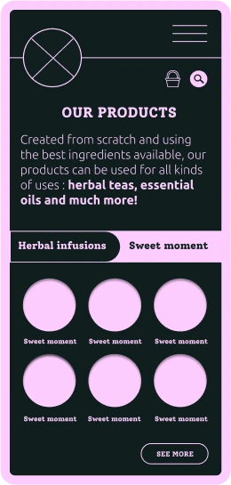
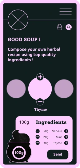
The main functionality allows clients to create their own herbal mixture ... Ready to make a good soup together ?
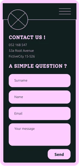
Main screens
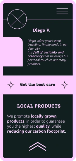
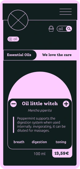
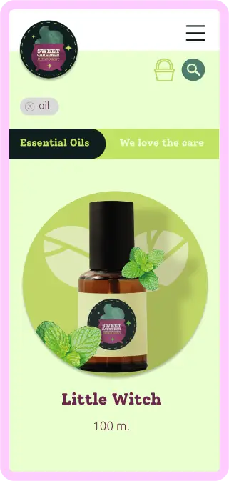
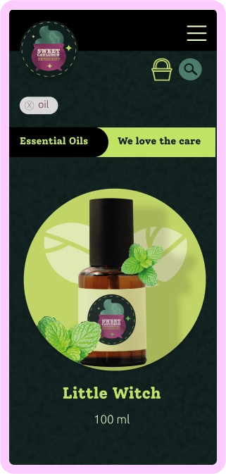
The general atmosphere recalls gardens, rurality, simplicity and the mysteries surrounding herbalist practices ... and even witchcraft

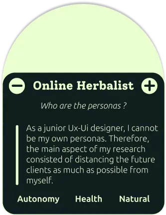
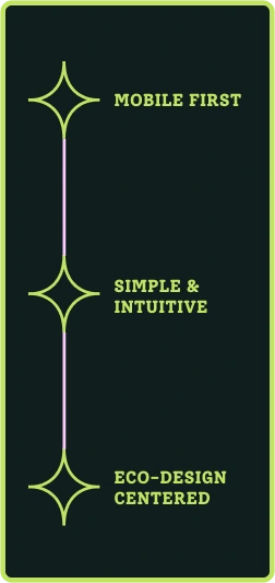
UX researchs
The mobile-first design allows you to get to the essentials, to avoid “filling in the gaps” with superfluous content or functionalities, while producing a simple digital service. In addition to simplifying and streamlining the user journey, an economy of resources and content allows an approach closer to eco-design
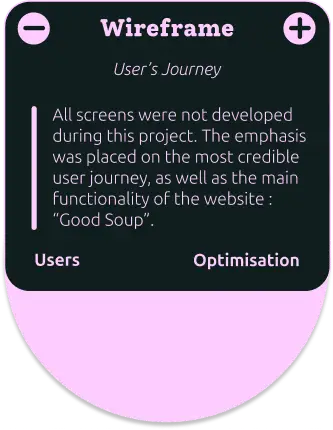
Wireframe
UI kit
Here are the components I created for the project “Sweet cauldron”. You’ll find some buttons and various icons


Identity
The choice of Solway and Ubuntu fonts was guided by the values of accessibility and readability. None of the content of the application was generated by artificial intelligence, eco-design being at the center of the project
The logo as been designed to strengthen the coziness and aura of mystery usually tied up with the witchy aesthetic. A simple steaming cauldron punctuated with stars highlights the main functionality that is “good soup” : you, as the client, can create your own magic mixture
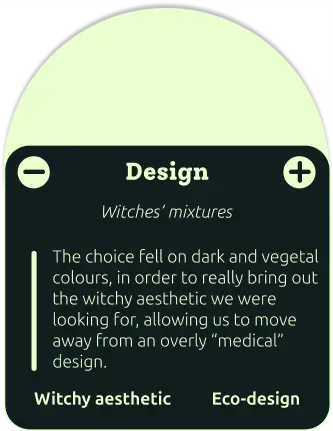
The final choice felt on dark and vegetal colours, in order to really bring out the witchy aesthetic we were looking for, moving away from a first overly “medical/pharmaceutical” design


Discover more
This project is better illustrated on Behance. I will add information here (and probably a French version of this website) as soon as I got the time